BRANDING + BRAND STRATEGY
Papijon
A boutique bowtie brand needed an identity that would elevate the humble accessory into a symbol of personal expression and storytelling. The challenge was creating a brand that balanced sophisticated craftsmanship with playful personality while appealing to both traditional and contemporary sensibilities.

The identity system centers on the concept "Stories That Tie The Heart," emphasizing Papijon's role in life's meaningful moments. The minimalist logomark features custom typography with subtle angular elements reflecting precision tailoring.
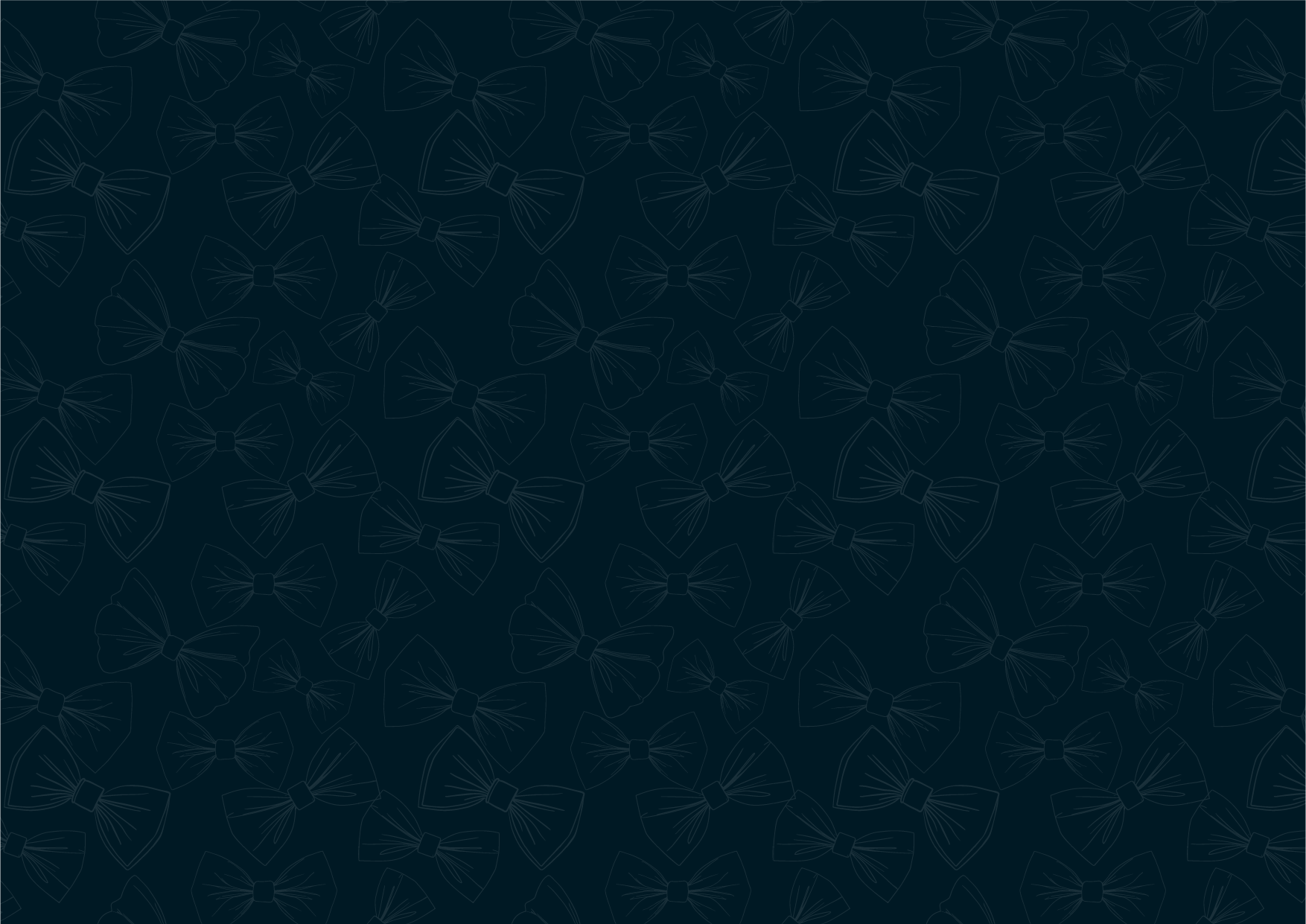
The color palette combines deep navy and neutral tones to create a sophisticated foundation, complemented by warm accent colors that add approachability and charm. The signature bow tie pattern appears as a subtle background element throughout brand applications.
Typography pairs the modern geometric Outfit font family for headlines and body copy with the elegant Playfair Display for accent text, creating a perfect balance of contemporary and classic styles.

Visual Language
The brand's visual language emphasizes:
Clean, minimalist design with thoughtful details
Illustration style featuring simple, elegant line drawings
Photography that captures authentic moments and genuine emotion
Pattern work inspired by bow tie forms and fabric textures
The Feedback
I have been consistently impressed by Selen's professionalism and dedication to her craft. She is always receptive to feedback, promptly incorporating suggestions to ensure that the final deliverables exceed expectations. Her unique ability to infuse the brand with energy and finesse has undoubtedly set Papijon apart in the competitive market. Selen has an innate talent for understanding the essence of a brand and translating it into impactful marketing strategies that resonate with our target audience.
— Marie from Papijon


